Published 5/8/25
As we continue to deliver on our commitment to provide a user-friendly experience with accessible payment options for everyone, we’re excited to announce the next round of updates to the payment experience. Let’s take a closer look at some of the exciting changes we’ve made for this month:
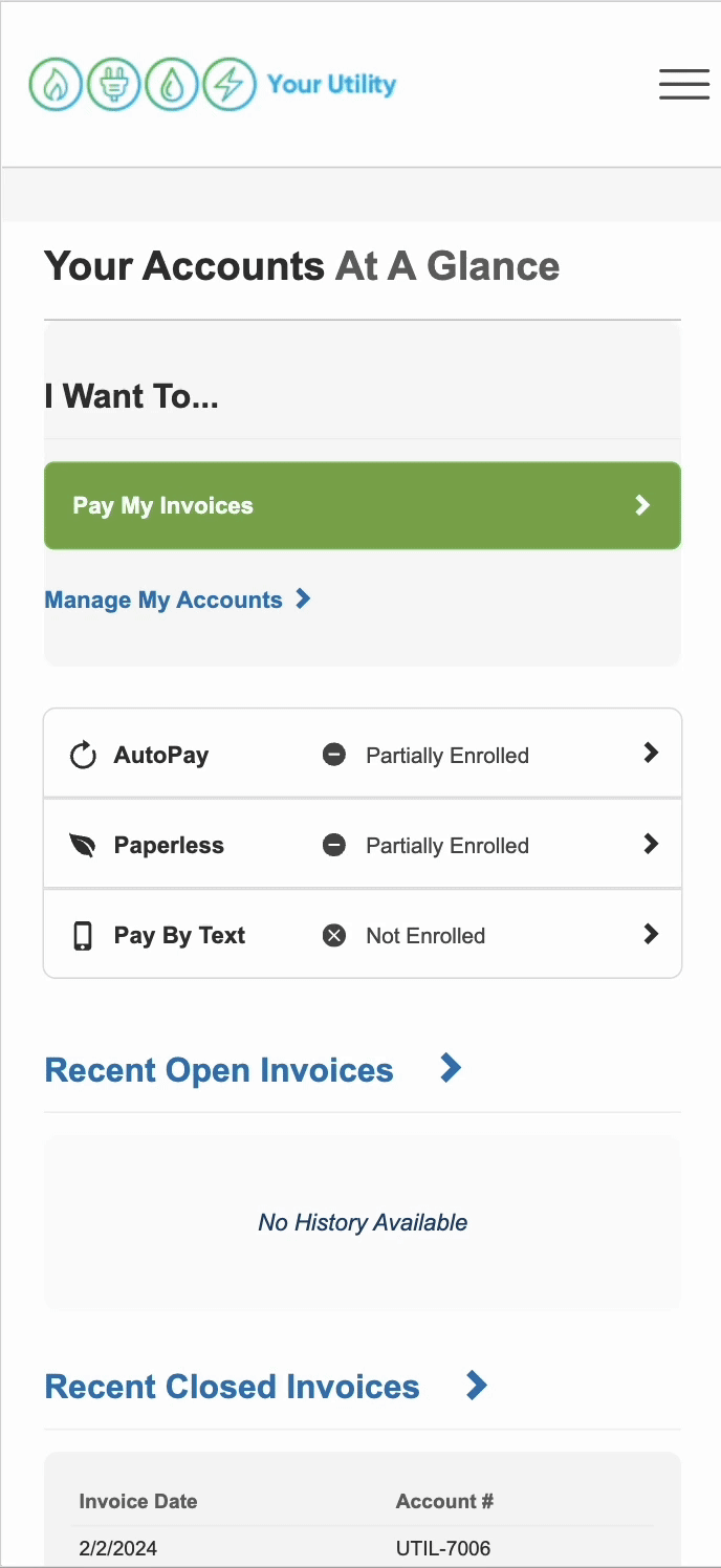
Streamlined Customer Payment Route
We’ve made significant improvements to make payment navigation easier, ensuring a cleaner and more intuitive design for both signed-in (customer portal) and signed-out users (virtual site). Key updates include:
- Bolded selections in the navigation for easier identification
- Lighter, white background for better contrast and viewability
- Increased font sizes in mobile navigation drop-down menus for improved readability
- Updated home icon and a redesigned selection menu
- Removed redundant icons in mobile navigation for a simplified experience
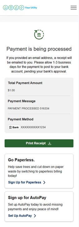
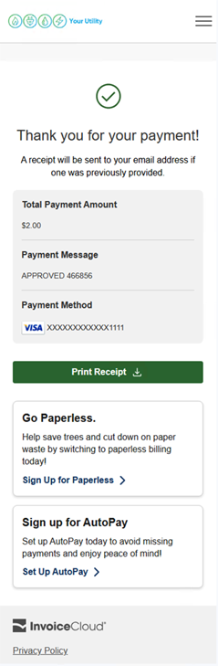
Payment Confirmation Receipt Page Updates
We’ve also updated our payment confirmation receipt page to make it more clear and user-friendly.
- Payment processing language now corresponds with the payment type used, clearly indicating the status of your payment.
- For bank payments: Payment is being processed
- For all other payments: Thank you for your payment!
- New receipt table displaying payment information.
- Modern icons and logos for a fresh look.
- Print receipt transformed from a link into a button that is easier to see.
Make sure to stay connected with Cloudburst for more updates throughout the year, as we continue our quest to make digital payments easier, and more accessible for everyone.